1. Introduction
Take a look at the figure below which displays the price level and trading volume of the  to
to  . What’s more, the red vertical lines in the top figure show the intraday range for the traded price, and these bands stretch
  per share in some cases. People are trading this ETF at all sorts of different investment horizons. Any model fit to daily data will ignore really interesting economics operating at these shorter investment horizons. Vice versa, any model fit to higher frequency minute-by-minute data will miss out on some longer buy-and-hold decisions.

In this post, I ask a pair of questions: (a) “Is it possible to recover the most ‘important’ investment horizons from the time series of SPDR prices?” and (b) “What statistical techniques might you use to do this?”
I work in reverse order. After outlining a toy stochastic process with a clear time scale pattern in Section 2, I start the real work in Sections 3 and 4 by discussing a pair different statistical tools you might use to uncover important time scales in this asset market. Here, when you read the word ‘important’ you should think ‘time scales where people are actually making decisions’. In Section 3, I outline the standard approach in asset pricing of using a time series regression with multiple lags. Then, in Section 4, I show how this technique has an equivalent waveform representation. After reading Sections 2 and 3 it may seem like it’s always possible to recover the relevant investment horizons from a financial time series. In Sections 5 and 6, I end on a down note by giving a counter example. The offending stochastic process is a workhorse in financial economics—namely, the Ornstein-Uhlenbeck process. Thus, the answer to question (a) seems to be: No.
You can find all of the code to create the figures below here.
2. Toy Stochastic Process
The next  sections discuss different ways of recovering the relevant time scales from a financial data series. In particular, I am interested in the time series of log prices as I don’t want to have to worry about the series going negative. I define returns,
  , as:
, as:
(1) 
and assume that both log prices and returns are wide-sense stationary so that:
(2) ![\begin{align*} \mathrm{E}[x_t] &= 0 \quad \text{and} \quad \mathrm{E}[x_t \cdot x_{t - h \cdot \Delta t}] = \mathrm{C}(h) \cdot \sigma^2 \end{align*}](https://alexchinco.com/wp-content/ql-cache/quicklatex.com-189e908a8df39756af726aa96820a7cb_l3.svg "Rendered by QuickLaTeX.com")
for  where
where  denotes the
  -period ahead autocorrelation function. I use
  instead of the usual
  in the time subscripts above because I want to emphasize the fact that the log price and return time series are scale dependent. In the analysis below, I’m going to think about running the analysis at the daily horizon so that
  .
.
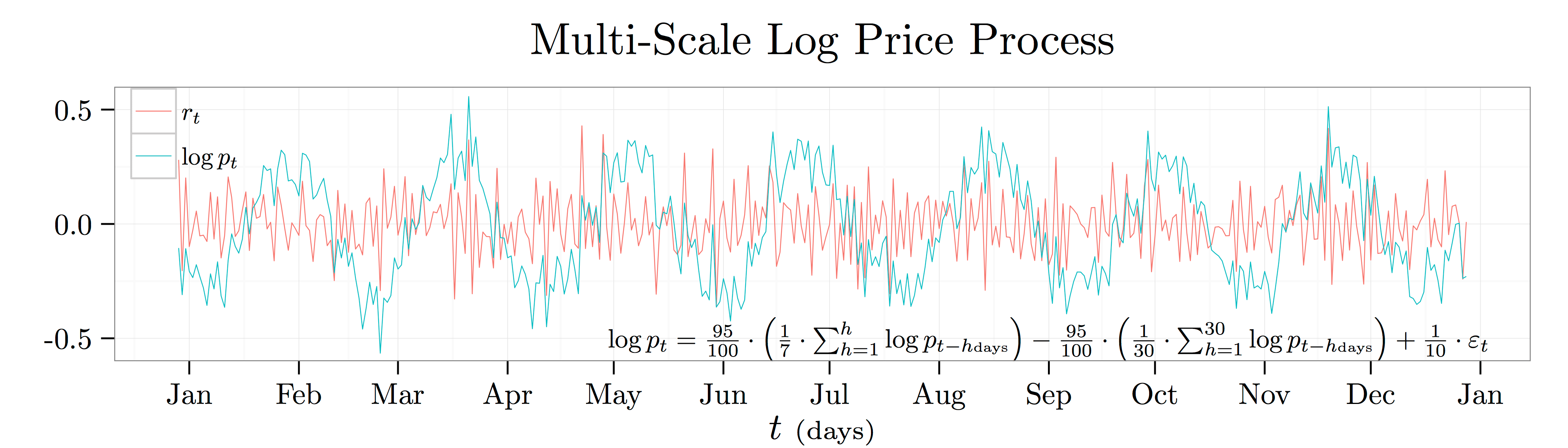
To make this problem concrete, I use a particular numerical example:
(3) 
I plot a year’s worth of daily data from this process (err… I am using calendar time rather than market time… so think  not
not  ) in the plot above. This process says that the log price today will go up by
  cents whenever the average log price over the last week was
  unit higher, but it will go down by cents whenever the average log price over the last month ago was unit higher. It’s a nice example to work with because there is an obvious pattern in log prices with a period of just south of months.
3. Autoregressive Representation
The most common way of accounting for time series predictability in asset pricing is to use an autoregression. e.g., you might run a regression of the log price level today on the log price level yesterday, on the log price level the day before, on the log price level the day before that, and so on…
(4) 
Note that because of the wide-sense stationarity of the log price process the regression coefficients simplify to just the horizon-specific autocorrelation:
(5) ![\begin{align*} \beta_h &= \frac{\mathrm{C}(h) \cdot \mathrm{StD}[\log p_t] \cdot \mathrm{StD}[\log p_{t-h}]}{\mathrm{Var}[\log p_{t-h}]} \quad \text{and} \quad \mathrm{StD}[\log p_t] = \mathrm{StD}[\log p_{t-h}] \end{align*}](https://alexchinco.com/wp-content/ql-cache/quicklatex.com-106e16135db2a7a4fdcdc8ab08aef998_l3.svg "Rendered by QuickLaTeX.com")
Why might this approach make sense? First, for the process described in Equation (3), it’s obvious that the log price time series has an autoregressive representation since I constructed it that way. Second and more generally, this approach will hold due to Wold’s Theorem which states that every covariance stationary time series  can be written as the sum of time series with the first time series completely deterministic and the second completely random:
(6) 
Here,  is the completely deterministic time series and
  is the completely random white noise time series. The figure below shows the coefficient estimates,
  , from projecting the log price time series onto its past realizations for lags of anywhere from
  to
to  .
.

4. Waveform Representation
Fun fact: There is also a waveform representation of the same autocorrelation function:
(7) 
This representation will always exist whenever the data have translational symmetry. i.e., put yourself in the role a trader thinking about buying a share of the S&P 500 SPDR again. If you had to make a prediction about tomorrow’s price level as a function of the log price level today, its values week ago, and its value month ago, you wouldn’t really care whether the current year was 1967, 1984, 1999, or 2013. This is just another way of saying that the autocorrelation coefficients only depend on the time gap.
Where does this alternative representation come from? Why translational symmetry? Plane waves turn out to be the eigenfunctions of the translation operator, ![\mathrm{T}_\theta[\cdot]](https://alexchinco.com/wp-content/ql-cache/quicklatex.com-71b99adc212b89da76131822264a0352_l3.svg "Rendered by QuickLaTeX.com") :
:
(8) ![\begin{align*} \mathrm{T}_\theta[\mathrm{C}(h)] &= \mathrm{C}(h - \theta) \end{align*}](https://alexchinco.com/wp-content/ql-cache/quicklatex.com-81388b65dfdc423aeed598a2fc4233d1_l3.svg "Rendered by QuickLaTeX.com")
In the context of this note, the translation operator eats autocorrelation functions and returns the value  time periods to the right. i.e., if
  gave you the autocorrelation between the log price at any two points in time that are
  days apart, then
 ![\mathrm{T}_{1{\scriptscriptstyle \mathrm{day}}}[\mathrm{C}(4{\scriptstyle \mathrm{days}})]](https://alexchinco.com/wp-content/ql-cache/quicklatex.com-dd1d99221a5da52cfdcd9c5183467f19_l3.svg "Rendered by QuickLaTeX.com") would give you the autocorrelation between the log price at any two points in time that are
would give you the autocorrelation between the log price at any two points in time that are  days apart. Note that the translation operator is linear since translating the sum of functions is the same as the sum of translated functions. Thus, just as if was a matrix, we can ask for the eigenfunctions of written as
  :
:
(9) ![\begin{align*} \mathrm{T}_\theta[\mathrm{C}_f(h)] &= \mathrm{C}_f(h - \theta) = \lambda_{f,\theta} \cdot \mathrm{C}_f(h) \end{align*}](https://alexchinco.com/wp-content/ql-cache/quicklatex.com-c49b84194f66b339d12de6cc71ae9967_l3.svg "Rendered by QuickLaTeX.com")
Such a process is obviously given by the complex plane waves with  and
and  .
.
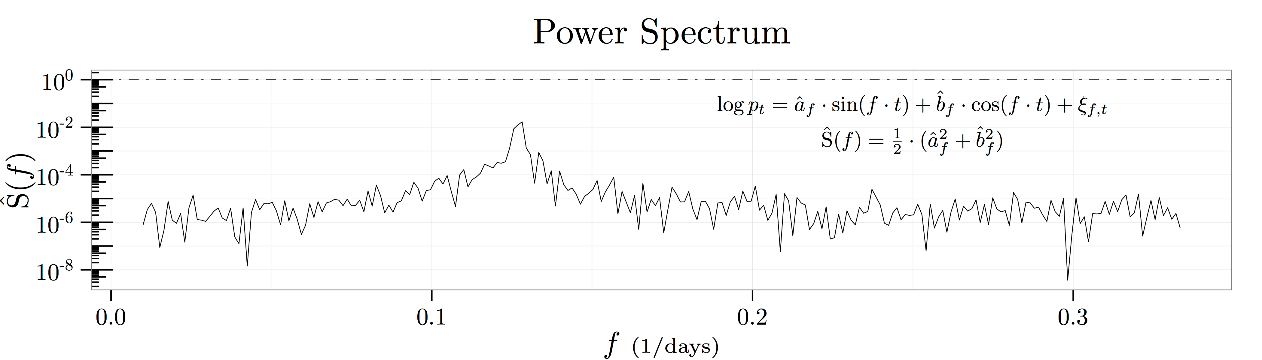
As a result, we can think about recovering all the information in the autocorrelation function at horizon by projecting it onto the eigenfunctions  as depicted in the figure above known as a spectral density plot. This figure shows the results of
  regressions at frequencies in the range
 ![[1/100{\scriptstyle \mathrm{days}},1/3{\scriptstyle \mathrm{days}}]](https://alexchinco.com/wp-content/ql-cache/quicklatex.com-9c36912dbbc895ed4771ea183a1cf7db_l3.svg "Rendered by QuickLaTeX.com") :
:
(10) 
Roughly speaking, the coefficients  and
and  capture how predictive fluctuations at the frequency
  in units of
  are of future log price movements. Thus, the summary statistic
  captures how much of the variation in log prices is explained by historical movements at the frequency . This statistic is known as the power of the log price series at a particular frequency.
The Wiener-Khintchine Theorem formally links these two different ways of looking at the same autocorrelation information:
(11) 
Using Euler’s formula that  and keeping only the real component yields the following mapping from frequency space to autocorrelation space:
(12) 
where I assume that the range ![[0,F]](https://alexchinco.com/wp-content/ql-cache/quicklatex.com-e3f1473219fe5026f532e4a37a4e7bc4_l3.svg "Rendered by QuickLaTeX.com") covers a sufficient amount of the relevant frequency spectrum. The figure below verifies the mathematics by showing the close empirical fit between the two calculations.
covers a sufficient amount of the relevant frequency spectrum. The figure below verifies the mathematics by showing the close empirical fit between the two calculations.

5. A Counter Example
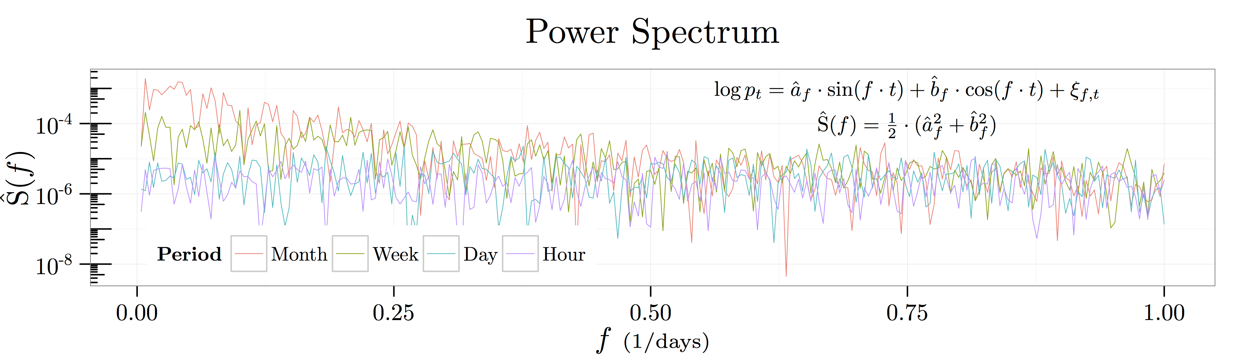
After giving some tools to mine relevant time scales from financial time series in the previous sections, I conclude by giving an example of a simple stochastic process which thumbs its nose at these tools. Before actually looking at the example, it’s worthwhile to stop for a moment to think about the sort of process which might be hard to handle. You can see glimpses of it in the analysis above. Specifically, note how even though I created the time series in Equation (3) using a  day moving average and a
  day moving average, there is no evidence of these time horizons in the sample autocorrelation coefficients. It’s not as if the figure shows a coefficient of:
(13) 
for all lags  . Likewise, the spectral density of the process shows a peak at somewhere between
  and
and  . Thus, the time scale we see in the raw data is an emergent feature of the interaction of both the weekly and monthly effects. Intuitively, it would be very hard to identify the economically relevant time scale from a stochastic process where interesting features emerge at all time scales.

An Ornstein and Uhlenbeck gave an example of just such a stochastic process. Take a look at the figure above which plots the following Ornstein-Uhlenbeck (OU) process:
(14) 
With  day, the equation above reads: “Daily changes in the log price are
  on average. However, the log price realizes daily kicks on the order of
  th of a percent, and these kicks have a half life of
  days.” Thus, it’s natural to think about this OU process as having a relevant time scale on the order of month, and you can see this time scale in the sample log price path. The peaks and troughs in the green line all last somewhere around month.
Here’s the punchline. Even though the process was explicitly constructed to have a relevant monthly time scale, there is no obvious bump at the monthly horizon in either the autoregressive representation or the waveform representation. In fact, OU processes are well known to produce  noise—i.e., noise which follows a power law decay pattern as shown in the figure below. Kicks which have a half life on the order of days lead to emergent behavior at all time scales!
6. Uniqueness of Approximations
Of course, there is a mapping between the precise rate of decay in the figure below at the relevant time scale, but this is besides the point. You would have to know the exact stochastic process to know to reverse engineer the mapping. What’s more, this problem isn’t an issue that will be solved with more advanced filtering techniques such as wavelets. It’s not that the filtering technology is too coarse to capture the real structure. It’s that the real time scale structure created by the OU process itself is incredibly smooth. If you see a price process whose power spectrum mirrors that of an OU process with decay, you can’t be sure if its an OU process with a monthly time scale as above or a process economic decisions being made at each horizon.
This result has to do with the fact that even very well behaved approximations are only unique in a very narrow sense. What do I mean by this? Well, consider asymptotic approximations where the approximation error is smaller than the last term at each level of approximation. i.e., the approximation:
(15) 
is asymptotic to  as
as  if for each
  :
:
(16) 
Asymptotic approximations are well behaved in the sense that you can naively add, subtract, multiply, divide, etc\ldots them just like they were numbers. What’s more, for a given choice of  , all of the coefficients
  are unique.
At first this uniqueness result looks really promising! However, on closer inspection it’s clear that the result is rather finicky. e.g., the same function can have different asymptotic approximations:
(17) 
What’s more, different functions can have the same asymptotic approximations:
(18) 
What’s really interesting about this last example is that these functions have asymptotic approximations that share an infinite number of terms!
To close the loop, consider these approximation results in the context of the econometric analysis above. What I was doing in these exercises was picking a collection of  and then empirically estimating
  . For each choice of approximations, I got a unique set of coefficients out. However, the counter example above in Section 5 shows that data generating functions with very different time scales can have very similar approximations. The analysis in this section shows that perhaps this result is not too surprising. A different way of putting this idea is that by choosing an approximation to data generating process, , you are factoring the economic content of the series into different component: and . If you take a stand on the terms, the corresponding will certainly be unique; however, there is no guarantee that these coefficients carry all of the economic information that you want to recover from the data. e.g., the relevant time scale information might be buried in the series rather than the coefficients .
You must be logged in to post a comment.